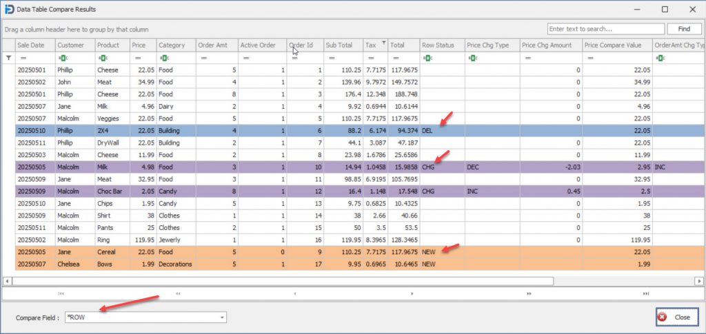
The above screen capture shows the first view you will see when you hit the compare button. It shows the results visually as to what rows have been added, deleted, or just changed. The new rows are colour coded in light Orange, the deleted rows are highlighted in a light blue, and finally the rows that have been changed are highlighted in a light purple. These colours allow you to easily recognize how the data sets have changed over time. It allows you to focus your attention to the changes that are important to you.
Note the column “Row Status” shows the changes in a Text format (NEW, DEL, CHG). As well – note the bottom left hand corner of the screen – here you can see that *ROW level comparison has been selected.
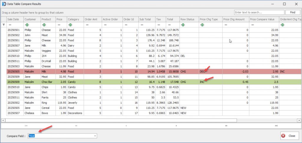
In the screen capture above – it shows a different view of the comparison data. In this view – the user has chosen one of the Comparison fields selected on the previous screen – in the lower left hand corner. In this example it is the Price field.
Here you can see easily see which rows have had a Price increase or decrease. In this case the rows for Milk and Choc Bar have seen price changes.
The original price is shown in the original fields on the left side of the grid, while the new prices and the changed amounts are shown on the right hand side.