Understanding what is happening with your data over time is a big part of of any analysis project! It enables you to understand the history – and hopefully be able to project where things may go in the future. InSights provides a very easy way to do this! Out Trending feature allows the user to select multiple tables to trend over, and then the fields they want to compare, the date field to use and that are considered the ‘key’ fields to group the data by. It is all point and click, no coding required!
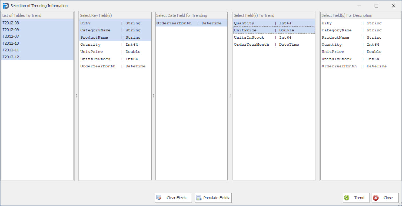
Trending Selection (Tables & Fields)
When you start the trending process the above screen will be shown. This screen allows you to select what in memory data tables you want to include in the trending process. Once you have chosen your tables – you can click the Populate Fields button at the bottom and it will put the fields in the four list boxes at the top.
Here you can select the key fields that you want to use to break down your fields to trend. These field(s) are used in the Legend to allow you to identify the lines in your chart. After that you can select what Date field you want to trend the data over, and what fields you want to use when generating the points in the chart.
In the above screen we have selected to use the City, CategoryName, and ProductName fields as our key fields, OrderYearMonth as our date field for trending, and Quantity and UnitPrice as the fields to trend. Note that we have not chosen any fields for description – as the Key fields will provide enough to easily identify the chart lines.
Once you have selected the fields you want – simply click the Trend button at the bottom of the screen – and the following screen will be shown…
Trending Chart
When the screen is first shown – the chart to the right is blank. As you click on a record in the grid to the left – a line is added to the chart on the right. This allows you to choose what you want to trend – and even compare against other value combinations. In the image above you can see that we have selected all the Albuquerque/Beverages records.
Note that the Trending Field in the bottom left shows Quantity – however, you can easily change it to UnitPrice and add more lines to the chart. This allows you to trend two (or more) different values in the same chart…